
When Kevin Burkett, a Clemson University Extension agribusiness associate, and Justin Ballew, a Clemson fruit and vegetable research associate, restarted the South Carolina FarmGate Project, the goal was to gather valuable information on specialty crop acreage and yields to estimate crop value across the state.
It was an old tool and researchers needed it to be more powerful and work faster to help farmers guide their economic-based decisions about what they put in the ground each year.
For years, with the help of Clemson Cooperative Extension Service agents across the state, Extension associates manually gathered information and posted the data they collected on a previous FarmGate webpage. The process was cumbersome, labor-intensive and the final product was not very attractive. Reports were created crop-by-crop, while maps were often produced manually and shared only static, unengaging images.
Burkett and Ballew wanted something that was much easier to maintain, interactive for users and more pleasing to the eye. That’s when they turned to Kendall Kirk, director of the Clemson University Center for Agricultural Technology.
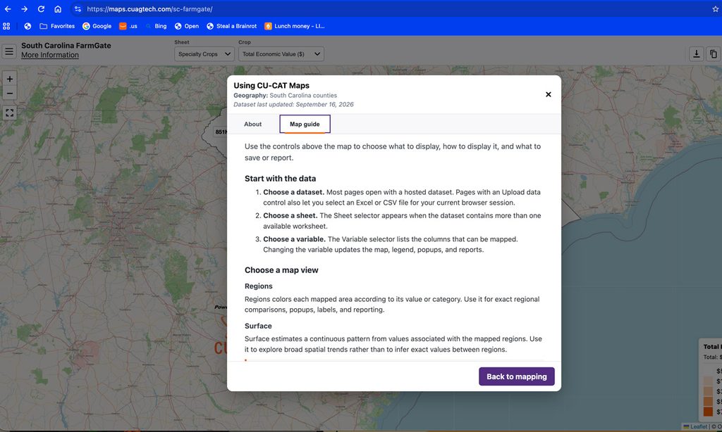
The result of that outreach is CU-CAT Maps, a platform that turns spreadsheet data into interactive maps and automatically generates reports. The South Carolina FarmGate map is one of several maps hosted on the platform.
What is FarmGate?
Clemson’s initial FarmGate reports were cumbersome to maintain, which is why the project paused for several years. Upon restarting, Burkett and Ballew looked for ways to streamline the process.
Instead of collecting data on all crops each year, they focused on specialty crops, dividing them into a three-year rotation, collecting data on about 15 select crops per year. Most of the collecting is done by Extension agents who reach out to farmers and ask them about acreage and yield.

“We created a survey whereas the horticulture agents are going around the state and working with farmers, they can report the acreage of different fruit and vegetable crops that are being grown,” Burkett said.
“They have a couple of months timeframe to do that. Once they’ve completed that, I take the data, clean it, compile it and try to see if there’s anything off with any of the data. Then, I come up with average prices and average yields. That gives us an estimated value of the crops. But the project would not exist were it not for the hard work the horticulture agents do in reporting the data from across the state.”
What was needed next was something to make that data easier to understand and share.
Making data look good
With data in hand, Burkett and Ballew said they wanted a “shiny new toy,” one with all the bells and whistles that would publish and maintain the data, and be visually appealing. It also needed to be mobile-friendly, customizable and simple for Extension staff to maintain.
“Kendall has helped us out with a number of other projects over the years, specifically some of the precision agriculture calculators,” Ballew said. “He also has some guys on his team who are trained and are really good with GIS (geographic information system). So, we knew they were the team for the job.”
They were right: Kirk started out by searching around for existing platforms that might support Extension’s needs – mapping and reporting with maintenance and hosting capabilities.
“We found nothing that was a good, suitable alternative,” Kirk said. “Since we didn’t find it, we said let’s see what it would look like to build it.”
Kirk then turned to artificial intelligence for some assistance, along with the help of Kevin Royal, a precision agriculture specialist with experience in GIS, a computer framework used to capture, store, analyze and display data tied to specific locations on Earth’s surface.
“We gave AI a try on this tool and it worked pretty well,” Kirk said. “We built something that would support the agents. They said, ‘We’ve got to be able to generate PDF reports. We want a statewide report and we want county level reports.’ We largely built this thing around them.”
The process became much faster and smoother.
The platform was designed around a familiar starting point – a spreadsheet. It allows FarmGate staff to continue working with data in a format they already understand, then upload the completed spreadsheet to the website. The system then uses that information to create interactive maps and generate statewide or county-level PDF reports.
The spreadsheet-based approach proved central to the project’s success.
FarmGate is one example of the platform’s spreadsheet-to-map workflow. Vistors can also use the site’s South Carolina County Mapper to select their own Excel or CSV file of county-level data and create interactive maps and reports.
“We that most people know how to build spreadsheets and how to manipulate the data,” Royal said. “It’s just a matter of putting together a way to link the data and connect spreadsheet information to the shape on the map.”
Burkett appreciates the more simplistic approach.
“I have to update a spreadsheet on the backside, but it’s a lot easier and a lot smoother than trying to go through and create 15 different crop reports, one at a time,” Burkett said. “It looks better but it’s also a faster process for us to be able to get the data out to the public. By the time I upload it, it’s five seconds before it’s on the website.”
“I just love how easy it is to use,” Ballew added. “There’s not a lot of fluff there. It’s streamlined and easy to see, good visuals, easy to take screenshots if you want to put some data in a presentation. It is easy to generate reports and print reports.”
What the data shows
The new interactive map displays each South Carolina county and the user can choose from numerous color palettes when viewing the data, including Clemson purple and orange.
A click on each county leads to a link for a county report that shows total economic value of the specialty crops and breaks down each individual crop with its acreage and economic value.
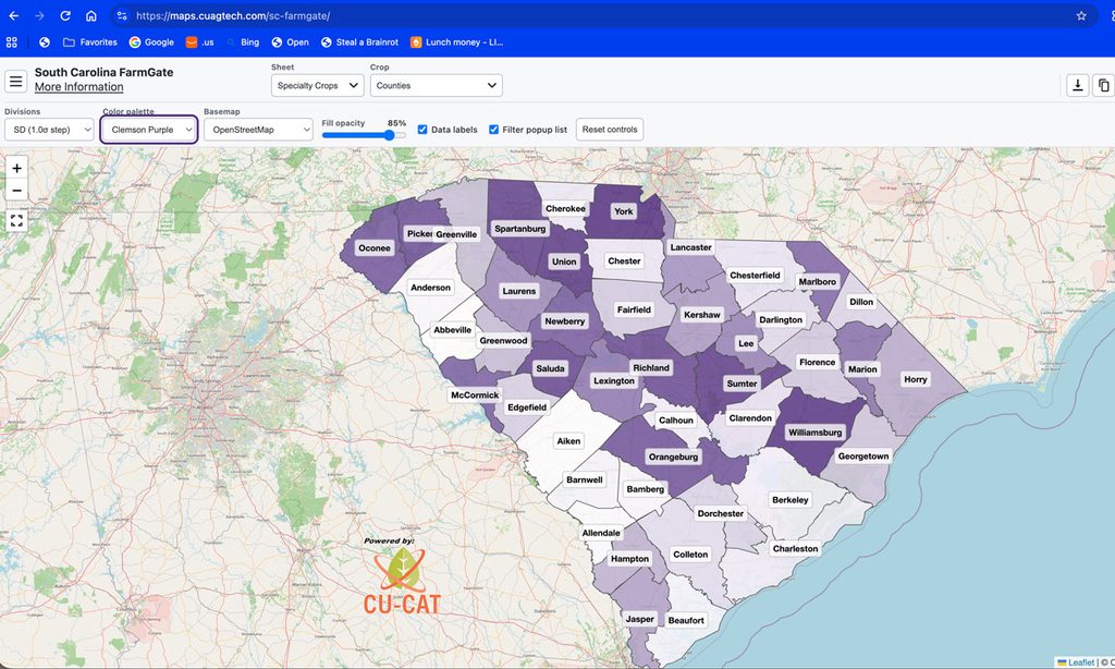
The platform gives users multiple ways to navigate the data. Someone researching a specific crop, such as strawberries, can begin by examining that crop’s statewide distribution. The click of a button can also generate a PDF of the report.
“It’s a lot easier for people to navigate through the site,” Burkett said.
The map can also display data by Extension regions, total economic value or by individual crops.
Accessible to all
When Dan Lewis, Clemson’s director of digital accessibility, got his first glimpse at the website, he almost couldn’t believe what he saw. From an accessibility standpoint, there was little to criticize.
“Sometimes if I reach out to folks, they might be a little apprehensive, like, ‘Oh no, what did I do wrong that’s not accessible,’” Lewis said. “But that was not the case here. I was like, ‘Kendall, this is amazing.’”
Lewis’s role is to ensure web content meets accessibility guidelines and that the software works for people with disabilities, such as limited vision, no vision, color blindness, limited mobility, etc.
“A lot of the features built into this support accessibility in a way that can be difficult to achieve when you’re thinking about an interface that’s inherently visual,” Lewis said. “When you go into that dashboard, there is a text-based version of that information that’s available and it’s accessible to assistive technology. Even if I couldn’t see, I could use a screen reader, navigate this interface, access that data in a structured format and it works.”
An unexpected bonus
The result is more than a new home for FarmGate data.
The platform now includes maps and tools for South Carolina counties, U.S. counties and U.S. states. Its nationwide county maps include Royal’s work on the Cropland Data Layer, soil properties, and pasture and grass datasets assembled for presentation in this format.
The collection also includes historical agricultural maps built from USDA NASS data, including U.S. county maps for corn beginning in 1910, cotton in 1919 and peanuts in 1925, along with South Carolina county maps for crops such as soybeans and peaches and livestock data such as cattle inventories.
CU-CAT now sees the platform as a possible foundation for other projects that need to display information geographically.
The same approach could support maps of disease outbreaks, agricultural trends or other datasets. A department or research group could maintain its own model in a spreadsheet, publish the relevant results and give users an interactive way to explore them.
“It made sense that we could expand this to anyone who wants to map something within Clemson, especially in agriculture,” Royal said. “The reasoning is you can map something in Excel, but it’s a little complicated and a bit limiting. It’s a little nicer if you can just pass along a URL for somebody to look at a website and interact with the data they want, generate their own reports, navigate around and color code it the way they want it to look.”
Those interested in learning whether CU-CAT Maps could be used to host and visualize their own datasets are encouraged to contact Royal (klroyal@clemson.edu) to discuss potential applications.
For FarmGate, the collaboration solved a specific reporting problem. For Clemson’s broader agricultural community, it created a reusable way to turn data into insight and look pretty in doing so. And it all started with a spreadsheet.